Extending the Usefulness of Yield Data to Across Field Profit Maps
Over the last couple of months, I have had several inquiries about profit maps, or rather, how to use yield data to produce a profit map representative of in-field yield variation. While creating these maps utilizes specialized geographic information systems (GIS) software, free programs such as QGIS have these analytical capabilities included as an integral part of the GIS. As with any analysis, the initial setup and creation of the necessary files should take precedent. Specifically, in order to create a profit map, you would need the field boundary, the yield data, the total costs, and the market price. It is also important to understand that while it is relatively easy to compute a whole field cost, in-field variability provides a more granular assessment of where the field is generating profits versus where the field is generating losses. For this example, we utilize 2020 soybean data provided by John Nowatzki of NDSU Extension.
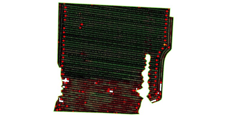
Although the initial exposure to GIS can be intimidating to those that may not have used this type of software before, the functionality required to compute the maps is an integral part of every GIS. Specifically, we need to take the yield data that is obtained and “clean” it to remove data anomalies and errors (Figure 1). Even prior to extending the yield information to a metric such as profit, the yield data when symbolized correctly can provide a unique perspective that allows for a quick qualitative assessment of overall yield.
 Figure 1: Typical yield map of a soybean field. The volumes in the data set range from 5–157 bushels per acre dry. In this example, it is clear that the lowest yields were found in the southernmost portions of the field. Field conditions can be quickly assessed throughout the season using sUAS imagery.
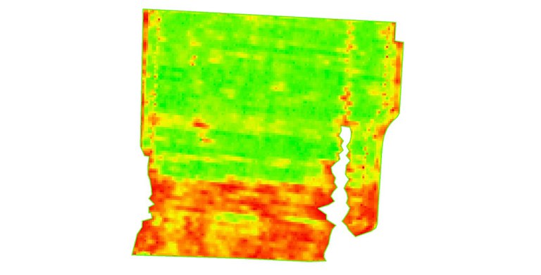
The next step is to generate a raster-based (image) surface from the points. While there are numerous ways to create these surfaces, for the purpose of this example I will simply utilize what is known as inverse-distance weighting (Figure 2). This is a traditional, yet still powerful method to create the surface, comprised of pixels much like a typical image. By creating an interpolated surface, we can use a variety of tools to calculate new values for each of the pixels. For example, if the pixel is 5m2 then the ground area that each pixel covers is 25 square meters. If the cost to plant one acre of soybean is $250.00, then each 5m2 pixel in the input surface would represent a cost of approximately $1.54 (4046.86 sq. meters in an acre).
 Figure 2: Interpolated surface from the input yield data, using a pixel size of 5m2.
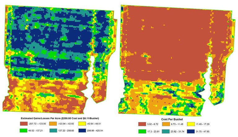
The process to move from the interpolated surface to an in-field profit map now consists of calculating the profit per cell (Figure 3). In terms of site-specific yields, we can answer questions such as “What areas of the field met or exceeded production goals?” or “What areas of the field generated the greatest profit this year?” When this information is combined with previous years, trends in profit or loss are evident. The basic formula to calculate profit is:
Profit = (Yield x Market Price) - Total Costs
While the equation used for the purpose of this article is relatively straightforward, there are numerous inputs that would affect total costs, for example. According to the USDA, the market price in North Dakota for soybean was $8.11 in August of 2020. For input costs we estimated $250.00/acre. These values would differ based on market prices, labor costs, etc. In addition to looking at in-field variability pertaining to profit, we can also look at how the cost per bushel varies across the field (Figure 4).
 Figures 3 & 4: Estimated profit map utilizing 5m2 cells and in input cost of $250.00. According to the USDA the market price for a bushel of soybeans in August of 2020 was $8.11 in North Dakota. The greatest ROI is found in the northern 2/3 of this field. As expected, the lowest cost per bushel to produce is correlated with the areas of the field showing the highest profits.
The use of GIS to analyze metrics such as profit and/or cost per bushel across a field represents a unique way to quantify a field’s performance beyond simple field averages. In some cases, shifting efforts to the more productive areas may have a significant impact on overall profit. Areas that offer low ROI may be better suited for other crops, or conversion to something like cover crops that may then be used for carbon offsets, for example.
Information for this article was obtained from the following sources:
USDA, “Agricultural Practices”. Released September 2020. ISSN: 1937-4216.
Murrell, T.S. and Rund, Q.B. “Using ArcGIS for Yield Data Analysis”. Proceedings of the ESRI International User Conference. 2003.
David Kramar, Ph.D.
David.Kramar@ndsu.edu
Precision Agriculture Specialist
John Nowatzki
NDSU Extension Emeritus – Agriculture and Biosystems Engineering


